Medicare Summary Experience
Transforming how millions of Americans stay up-to-date or find new coverage on Medicare.gov
Challenge
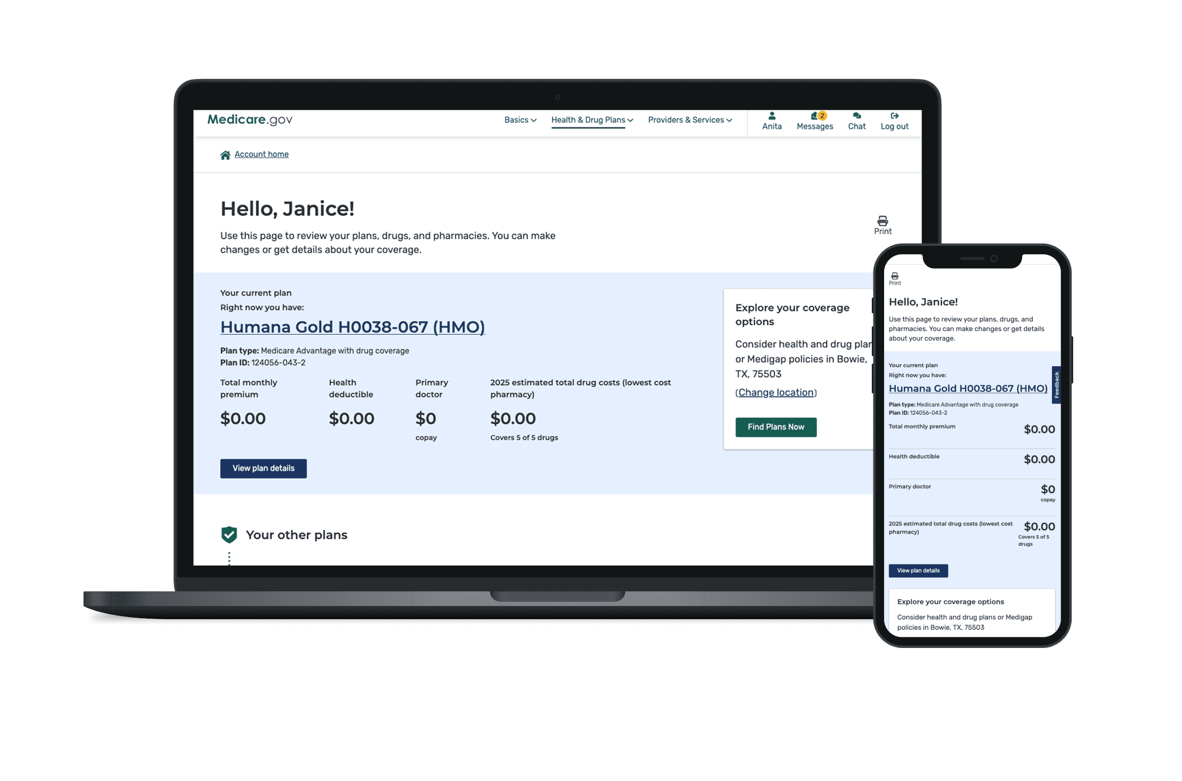
Users told us it was difficult to identify their current and most relevant plan information.
The Summary Page is there to help but wasn’t guiding them, however, users were unclear about what to do next or how to compare their plans. This led to missed opportunities for them to update plans or find more affordable coverage.

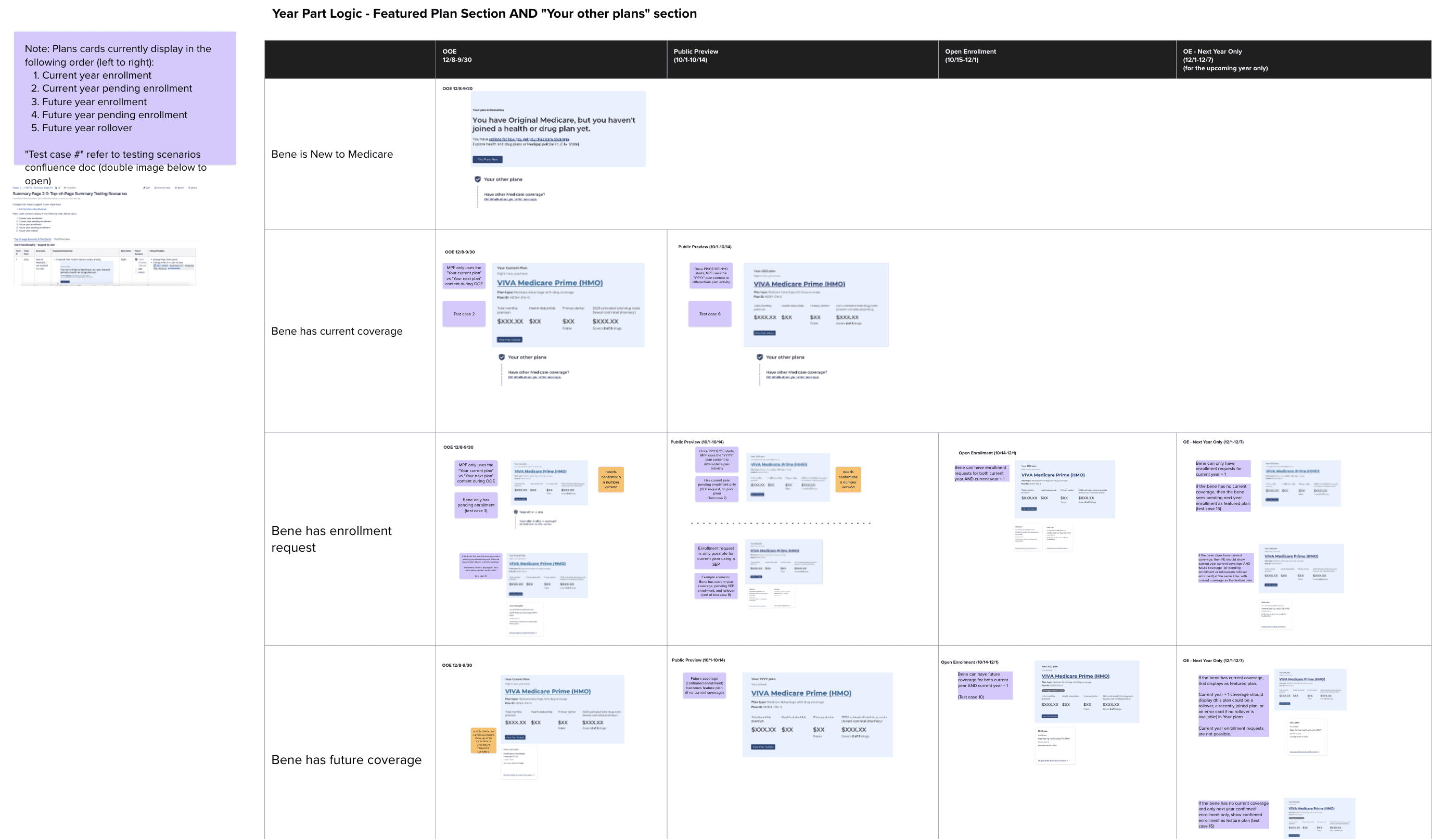
The Goal
Help users instantly understand their current plan.
Reduce confusion and surface key actions.
Make the "Find Plans Now" CTA obvious and accessible.
Support different user journeys during Open Enrollment and beyond
My Approach
Research & Discovery
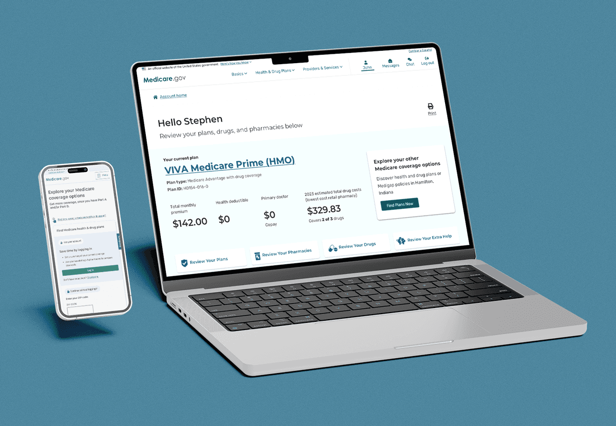
I reviewed analytics, survey feedback, and results from usability testing. One key insight: most users hadn't logged in for over 300 days. We confirmed that users weren’t seeing the Summary Page as helpful or actionable.
What users typically saw was a set of cards, each one with a plan or a callout - but without a lot of distinction in terms of priority or importance. To Medicare users, this led to confusion and inaction.
To frame our thinking, we asked How Might We:
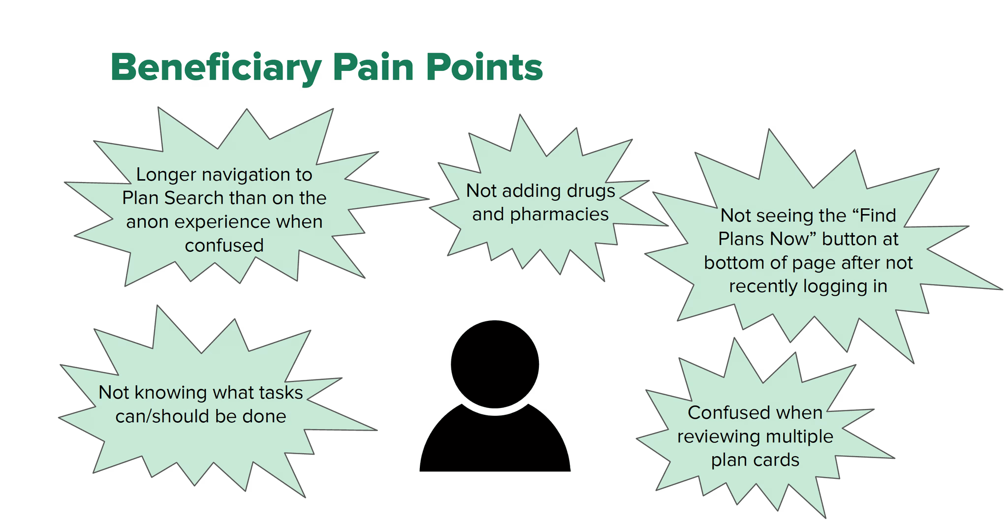
Help users quickly understand what their current plan includes?
Reduce the time it takes to find the "Find Plans Now" button?
Support users who haven’t logged in recently and feel lost?
Simplify the comparison of multiple plan cards?
Ideation
I collaborated with our product team and stakeholders to develop solutions aligned to the pain points above. During ideation, I gathered some of the primary pain points from the analytics and aligned them with possible solutions.
To frame our solutions, we asked Can we:
Display a user’s main plan summary right at the top to reduce cognitive load?
Move the "Find Plans Now" CTA to a fixed, top position for everyone?
Tailor the top-of-page content based on whether a user is enrolled or not?
Simplify the layout to show only the most essential information upfront?
Use smart messaging based on user status and enrollment period?
Wireframes & Visual Design
After presenting early ideas to stakeholder they gravitated towards the ideas of a 'top-of-page' summary card for current plan details and moved the "Find Plans Now" CTA to the top of the page for all users, and adjusted layout logic based on plan status or lack of plan data.
To frame our solutions, we asked Can we:
Display a user’s main plan summary right at the top to reduce cognitive load?
Move the "Find Plans Now" CTA to a fixed, top position for everyone?
Tailor the top-of-page content based on whether a user is enrolled or not?
Simplify the layout to show only the most essential information upfront?
Use smart messaging based on user status and enrollment period?


Agile Collaboration
I worked with developers and product leads to implement the experience in sprints. I joined standups, QA, and refinement meetings to make sure design intent was preserved.

User Testing
After implementation, the Medicare Division of Research facilitated a first-click tests with 43 participants and we analyzed the results.
Results
70% of users found the "Find Plans Now" button without help
67% accessed their plan details successfully
80% of users say they experienced less confusion and made more confident decisions.